So, I’ve always been interesting in the “xkcd type” of figures only because IT’S FUN.
My goal here is to make density plots of the most common probability functions using the xkcd style.
- First of all, we will need to load these packages:
library(xkcd)
library(dplyr)
library(ggplot2)- Now, we do a function using the ggplot2 sintax to make the plot. Note that we need calculate the axes ranges and apply “jitter” to x and y to create a hand-drawn effect in the line.
xkcd_density = function(x,y){

  # Calcule the axis range
  xrange = range(x)
  yrange = range(y)

  # Plot line type + jitter
  qplot(jitter(x),jitter(y),geom = "blank")+
    geom_line(linetype = 1,size=1.5)+
    theme_xkcd()+
    xkcdaxis(xrange,yrange)+
    xlab("")+
    ylab("")
}- Ploting the standart normal (0,1) density.
x = seq(-3,3,by=.1)
y = dnorm(x,mean=0,sd=1)
xkcd_density(x,y)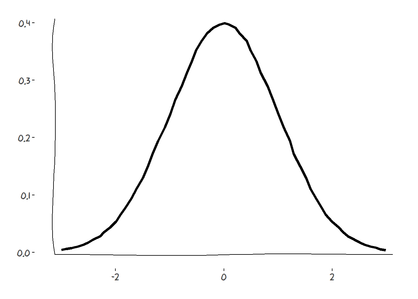
- Ploting the Chi square (df = 3) density.
x = c(0,seq(0.1,10,by=.1))
y = c(0,dchisq(x[-1],df=3))
xkcd_density(x,y)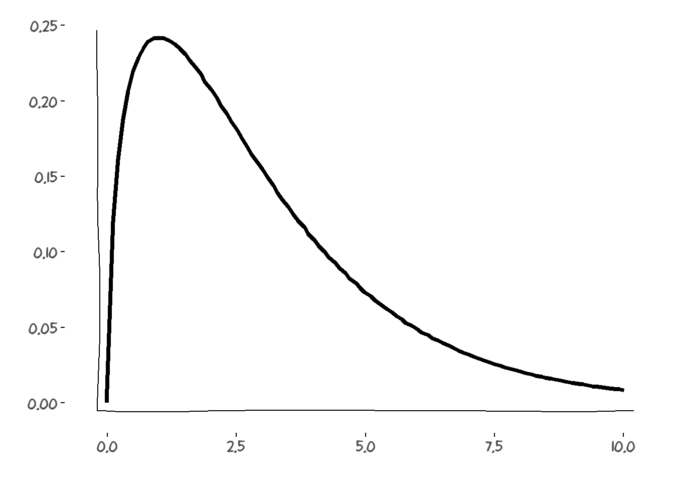
There you have! A nice looking (sort of) xkcd density plot!